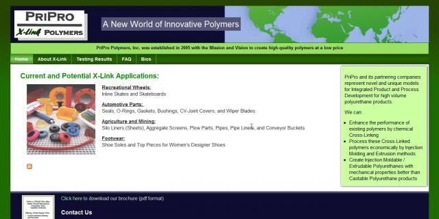
This customer asked us to do a rework of their polymer manufacturing site. The original site had a lot of confusing text placement and a very dry color scheme that was not very eye-catching or easy to read.
We designed a new header and chose a color scheme that was consistent with their manufacturing focus and international scope. We also added pages for their project specs and charts, and helped them upload their bios and product brochure.
By separating some text out into color boxes and placing different information on various pages, visitors are able to find and process the information in smaller pieces. Tabs help to sort the information even more, which is critical in a technical site.
- Login to post comments


