Linda Hollis knew about our services from our work on her other website, EMHsports.com.
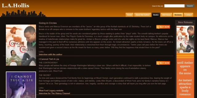
This time, Linda came to us wanting help to promote herself as an author. Her two books were very different from each other in style and purpose, so she needed a site that would work well with both, as well as any future books she may publish.
We also had a time crunch - book clubs were reviewing her newest book and she needed a video and some links right away.
We were given a few basic elements and guidelines: some photos, a little text, links to some reviews on book sites, and in a little over a week we had the site up and active.
After getting the basic structure entered, we gave Linda a selection of about 5 different color schemes. She could go online and switch themes and see instantly how that data would look in the different colors and layouts. Luckily, our favorite also turned out to be hers!
The chocolate and orange design enhanced both her new book and her older publication. We followed her instructions to draw the most attention to her new book, so that was given front page status. Some nice extra features we included were the subtle but attention-getting sidebars that slowly scrolled up to reveal reviewer comments, and an animated gif that another designer provided, with changing text on a bookmark-type graphic.
Linda also wanted a book trailer. Within a few days we constructed a video for her out of stock photos and stock music with some flashy text features and nice but not overdone page transitions. All this was easily managed by uploading the video to YouTube and then linking there directly from the site. Videos can be stored on and streamed from YouTube without leaving the website.
Finally, "Buy It Now" buttons were added with links to favorite stores, so that visitors can easily find places to buy Linda's books without her having to manage those sales herself.
- Login to post comments


