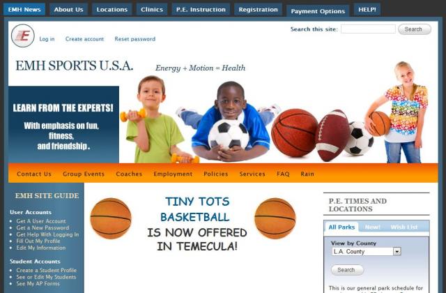
This is by far the most ambitious site we have worked on, and it is still evolving. When we first took over the site it was mostly used for information purposes. A few static text pages declared the purpose of the business, offered a list of locations and gave some contact information. A nice colorful banner headed up the site, but it was otherwise fairly colorless.
Keeping a similar structure, we pulled out some of the dominant colors to give the site a more eye-catching theme. Orange and blue seemed to go with the sports theme particularly well so we let those be the dominant colors.
The business was and still is evolving and expanding, so there was a need for a lot of new features and a dynamic page structure that could change with new content. The owners needed to be able to access and edit data. Visitors needed to be able to search for relevant information easily. We needed to add user accounts so that registrations could be stored and searched. Reports needed to be printed.
As the site grew we also needed to be able to create and process orders and connect payments to PayPal and other payment methods. Coaches and staff needed special access permissions. Customers needed personal emails sent automatically or at the touch of a button. We needed to be able to send rain and cancelation notices. Parents needed forums and the ability to check the status of registration. Instructional videos and lesson plans needed to be accessible by coaches with a password. A form was needed for job applications, and so on.
Designing all of this has been an adventure! Because the software we use is modular, each piece can be added in as needed, so the site grows as the business needs it to. Although the work is extensive and custom, we are only paid for our time. The end code and design is owed by the client, not by us. And since it is open source, anyone can freely use it or tweak it in the future should there be a time that the site needs to be handed off to someone else.
- Login to post comments


