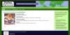
This client team had a specific need to promote seasonal baskets and to change the front page content with each holiday season.
They had some very nice photos, but the challenge was to come up with a color scheme that did not clash with the change in seasons, since many baskets would obviously have a certain look and color combination for each holiday.
We eventually settled on a cream background, since it was neutral but not too white and glaring. Since the photos were already on white, the warmer background highlighted each basket nicely, and a thin black border around each photo gave the site a "photo album" look. A touch of gold and purple gave an elegance to the site as well, especially since most baskets were of a rustic nature (wood or wicker) but they did not want the site to look rustic.
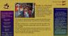
There was also a need to attach keywords to each basket and allow the menus to lead the customer to the various themes. Plus we needed to be able to promote certain baskets to the front page with the click of a button.
In the end the client was able to control the uploading of new baskets, promotion of specific photos, price and description, keywords and sorting, all without programming skills. We did the coding behind the scenes so that they could manage their business and products without too much help from us. that is our main goal of a good site, so that the client is not dependent on us for all their little content changes!
- Login to post comments